Join the NashTech Journey
Where technology meets excellence
0
+
Nashers around the world
0
countries where we work
0
+
trainings and courses every year
0
+
employer awards in last 10 years
Featured jobs
Explore moreSenior Software Engineer - .NET Hot job New
Hanoi - Vietnam, Ho Chi Minh - Vietnam / Hybrid
Experienced
Great people who create
a global community


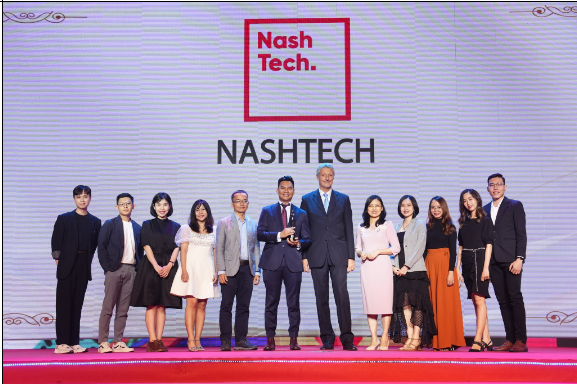
Employer awards
We are proud of NashTech's achievements and recognition as an employer. It will be
always important for us to build an inspiring and rewarding environment together.

HR Excellence 2021
Workplace Culture Award

Top Vietnam ICT Companies
Program from 2020 to 2022

Vietnam Best Place to Work
2017, 2019, and 2022

Best Companies to Work
for in Asia
for in Asia
2021, 2022 and 2023

Best Employer Of Choice by VN Student
from 2008 to 2022

Sao Khue Award
from 2008 to 2022

Great place to work (India)
Three years in a row
2021-22, 2022-23, 2023-24
2021-22, 2022-23, 2023-24
west
east

HR Excellence 2021
Workplace Culture Award

Top Vietnam ICT Companies
Program from 2020 to 2022

Vietnam Best Place to Work
2017, 2019, and 2022

Best Companies to Work
for in Asia
2021, 2022 and 2023

Best Employer Of Choice by VN Student
from 2008 to 2022

Sao Khue Award
from 2008 to 2022

Great place to work (India)
Three years in a row
2021-22, 2022-23, 2023-24
west
east

HR Excellence 2021
Workplace Culture Award

Top Vietnam ICT Companies
Program from 2020 to 2022

Vietnam Best Place to Work
2017, 2019, and 2022

Best Companies to Work
for in Asia
2021, 2022 and 2023

Best Employer Of Choice by VN Student
from 2008 to 2022

Sao Khue Award
from 2008 to 2022

Great place to work (India)
Three years in a row
2021-22, 2022-23, 2023-24
west
east
Proud to be a Nasher
The company fosters an uplifting work culture, with supportive colleagues, abundant opportunities for personal and professional growth, and a strong emphasis on employee well-being. Collectively, these factors contribute to a positive and conducive work atmosphere.
Honey Sulkiya
Business Analyst Tokyo - Japan
I express gratitude for the opportunities NashTech has offered, enabling me to contribute my best skills while concurrently enhancing my knowledge and personality. Being a part of this wonderful organization is a constant source of inspiration and motivation for me.
Pranay Rajput
Tech Lead (AI/ML) Noida - India
I highly appreciate work-life balance environment at NashTech Japan where I can develop myself both in career and personal life.
Chi Pham Thi Kim
System Analyst Tokyo - Japan
NashTech provides an excellent environment for long-term development, as it highly values and encourages a culture of mutual learning and sharing.
Toan Ngo Quang
Senior Engineering Manager Hanoi - Vietnam
I'm grateful to NashTech for exceptional growth, leadership, and a proud company culture.
Nam Tran Phuong
Technical Architect Hanoi - Vietnam
What makes NashTech a great place to work?
GLUE: Giving little unexpected extra
Deliver WOW to internal and external customers
Go 1% beyond the expectation
Pursue growth, learning and creativity; Build a positive team and family spirit
Think bold, think fast!
Embrace and drive change as well as continuous learning and adaption
Sharing is caring
Knowledge sharing and helping others to be their best
News
Explore more
Award
August 28, 2023
Trusted by Enterprises Globally


